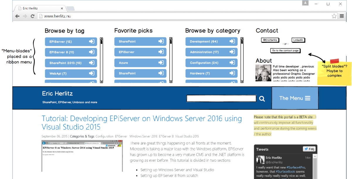
Since I decided to release this blog in a beta state I figured it'd be a decent thing sharing the planning and development process of the project. This is where I am at now, figuring out a new type of menu, currently called the “Blade Menu”
The basic idea is to have the menu sliding up at the top of the page when clicking the menu button revealing separate menu sections that should be presented as separate sections (called blades).
Below is an example of how it will look on a smart phone.
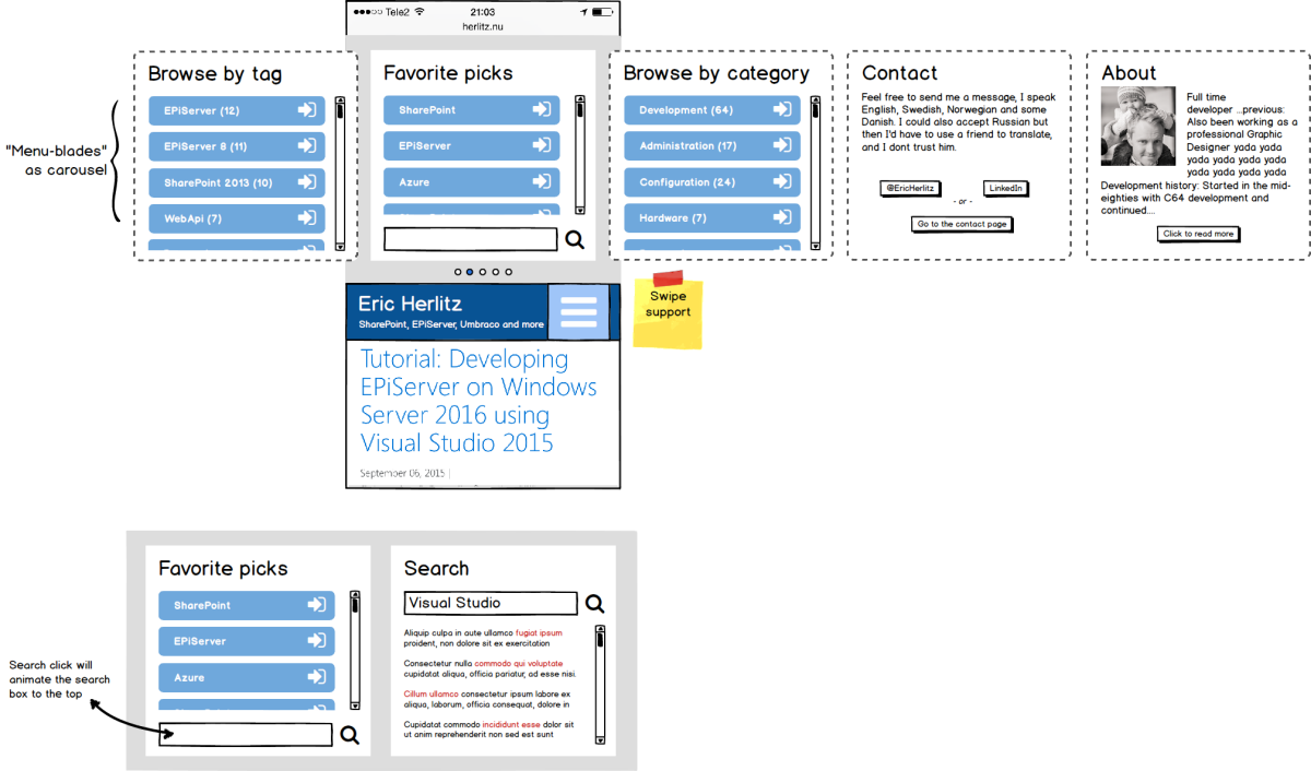
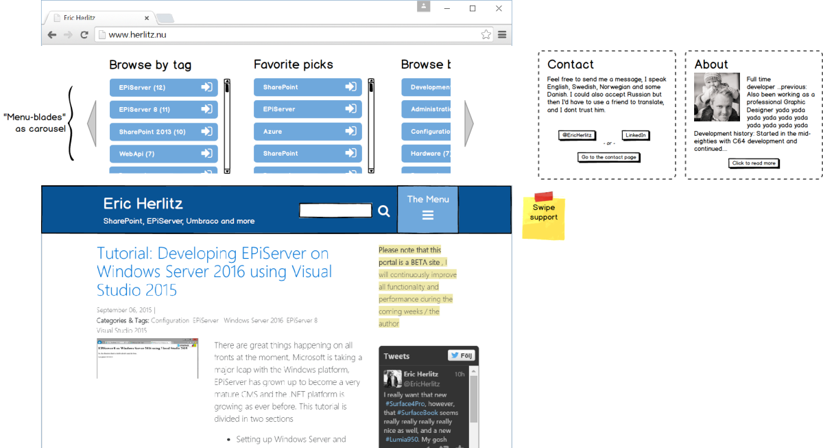
It will look similar on tablets as well, it will support swiping and probably horizontal mouse scrolling as well since this is a resolution that may be used on desktop clients as well
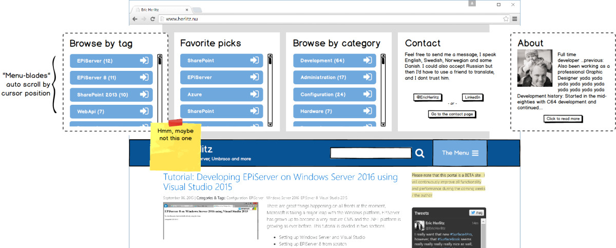
Haven't figured out the desktop version yet, first sketches below. But since this is sooper dooper agile I just may do some A/B testing on this.